A language as familiar as English is ripe for ambiguity and design. There are powerful wizards among us who can manipulate the symmetry of familiar words. We revere these wizards and call them Typographers. The most powerful Typographers can weave letter forms into fantastic illusions.
John Langdon is such a wizard. His genius for design was forged during the American art Renaissance of the 70’s as he immersed himself in the popular culture of art. Langdon’s design philosophy was influenced by the great poster designers of that time such as Rick Griffin and other artists such as Dali, Escher, and Rene Magritte.
In 1973 Langdon began designing a new set of letter forms which we now know as . Ambigrams are words that do not change their meanings when inverted, rotated or even reflected. The word “DIOXIDE” in caps is a natural ambigram. It reads the same when inverted because the letters are vertically symmetrical.
Langdon’s Ambigrams
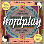
This first example from Langdon’s body of work is the masthead and title from his incredible book. Note the clean symmetry and elegance of the design. Note also that the word is not a natural ambigram. Langdon orchestrates the overall design to produce a pleasing and believable flow. Mouse-over the image to see the word rotated 180°.
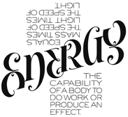
This next example is also from Langdon’s book Wordplay. It is called Energysm. As usual Langdon starts with a seemingly impossible asymmetrical word, in this case, the word Energy. Langdon transformes it into a natural flowing, symmetrical ambigram. Mouse-over to rotate the word 180° and to see another facet of its meaning.
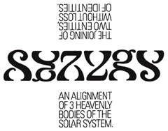
This next example is called SYZYGY. Talk about asymmetrical beginnings! Amazingly, Langdon the wizard has no trouble making radically different letters such as a “Y” and a “G” share the same space at different times. Imagine the intimate knowledge of letter forms required to produce these effects. Mouse-over to see the artwork rotated 180° and to see another facet of the word’s meaning.
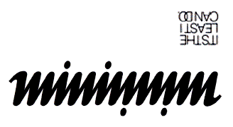
Our last ambigram example is called… we’ll let you figure out the word in this elegant, minimalistic design. Mouse-over to rotate the image 180° and see a clue that will help you identity the word.
Ambiguous Illusions
Look closely at the image below. This 1999 oil painting is a perfect example of a figure-ground reversal or ambiguous illusion. At first you only see the word OPTICAL in the open spaces of the design. Then the word ILLUSION resolves itself in the negative spaces. Ambiguity in its purest form.

Here is another amazing example of a ambiguous illusion. A battleground where two words existing in the same space compete for your attention. You may see one or the other, but scientists tell us that no one can see both at exactly the same time. John Langdon calls the oil painting below “US.” Can you tell why?
We’d like to thank John Langdon for being born in our lifetime. The good news is that he is working and producing a body of work right now in the present. We get to see a great artist’s work ahead of history for once. John Langdon currently works as a corporate logo designer, type specialist, and lettering artist. He teaches Typography and Design at The College of Media Arts and Design, Drexel University, Philadelphia.
To see more of John Langdon’s work, to learn more about this amazing teacher and artist’s philosophy, buy a print, or to get a copy of his book, Wordplay, visit John at his web site.
